Borders make items in a page stand out visually. Borders are commonly used for buttons, containers, and anywhere where divisions of content need to be clear.
Control element borders with the settings inside Advanced -> Borders.
Color
Set the border color.
Width
Set the thickness of the border.
Style
The default border style is none. Thus, there is no border.
To make the border visible, set this setting to one of the following:
- dotted – Specifies a dotted border
- dashed – Specifies a dashed border
- solid – Specifies a solid border

Unset all borders
To reset all border settings, click unset all borders. Styles for all borders are cleared.
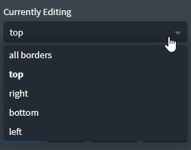
Individual side editing
By default, you are editing all borders simultaneously.
If you want to edit just one side, choose it from the Currently Editing dropdown.

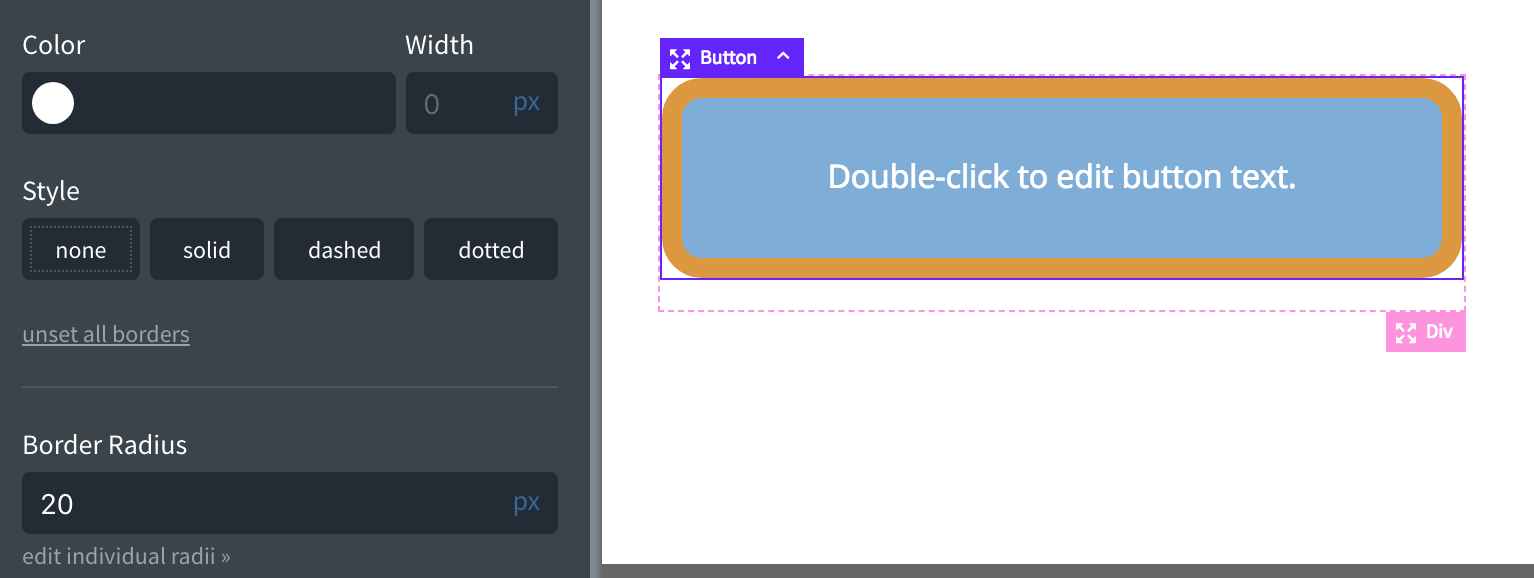
Border Radius
The effect of setting the border radius results in rounded corners. In fact, buttons with circular right and left sides are in fact rectangles with rounded borders. Their rounding radius can be large enough to make them appear circular.
Enter the radius in pixels to round the borders at all corners.

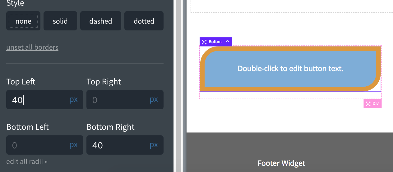
Edit Individual Radii
If you only want to round some of the corners, you can click Edit individual radii link under the Border Radius setting.

Border Styling Tips
- If you have a light element on a dark background, use a border color that is slightly darker than the background
- If you have a dark element on a light background, use a border color which is slightly darker than the element
- To darken the edge of an element, use a semi-transparent black border and set Background Clip to padding-box at Advanced > Background.

